Preview of Speakeasy app UI
Context
Speakeasy is a service that allows venues to upload secret menus that are discoverable by nearby consumers.
Role
This is an ongoing passion project I’m building independently as both designer and entrepreneur. Along the way, I’ve had exploratory conversations with developers to understand the engineering effort required, though current cost estimates make full implementation a challenge.
The challenge
I took on the challenge of designing a streamlined, dynamic platform that simplifies local discovery—removing clutter and friction while keeping the focus on what matters most.

For customers, I'd like to focus on information about happy hours and specials where it may be scattered, unreliable, or hard to find.

For venues, I'd like to fill the gap where existing tools (Yelp, Google Maps) aren’t optimized for promoting time-sensitive, or exclusive offers. The opportunity: design a system that makes nightlife discovery effortless, while giving restaurants an owned channel to drive foot traffic.
Speakeasy user flow
User flow
Diagram illustrates the steps between SSO/Auth and sharing a listing with friends. This also illustrates my goal of creating a minimal user experience that surfaces valuable information in the moment that it's most pertinent to the end-user.
Speakeasy type ramp
Foundations
I started with the Apple's type ramp as baseline for scaling typography. The goal is to neatly dovetail into an accessible and readable app on any magnification setting.
A/B testing Light & Dark User Interface
One of the initial A/B tests I have planned for this is app the value of light mode and dark mode. The hypothesis is to gain insight into how many users will override their system settings to set the app to light or dark mode based on time of day, demographics, and other factors.  
Next steps toward market readiness
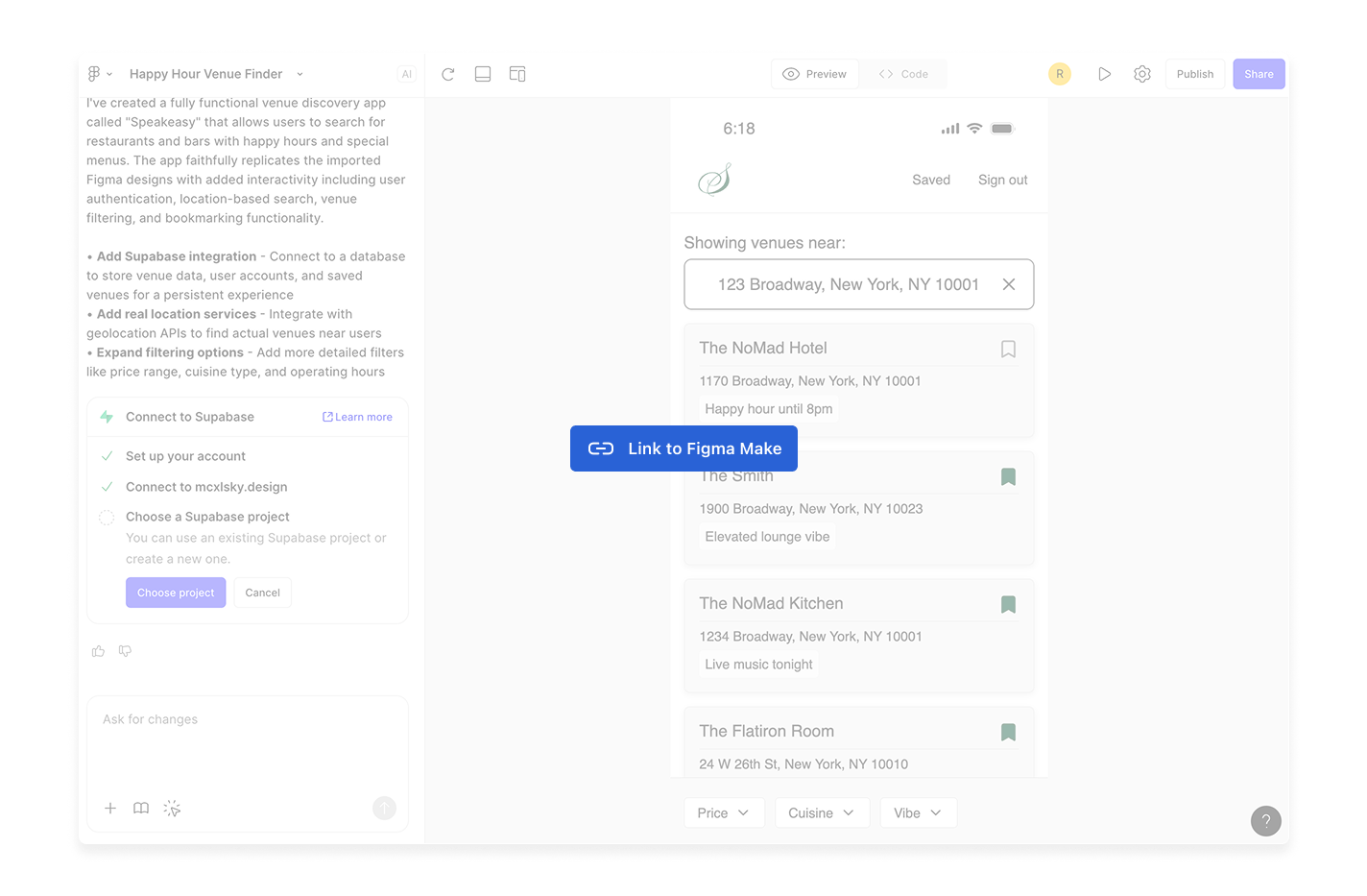
The bring Speakeasy closer to launch, the immediate step is leveraging AI to evolve the initial Figma Make build into a functional product foundation. This ensures that design intent translates seamlessly into working prototypes, accelerating iteration and user testing.
Feature Opportunities for an Enhanced Experience
From a design perspective, several features stand out as meaningful extensions of the core product. Each builds on the principle of creating a more engaging, feedback-driven dining experience:

Rate Your Server
Provide guests with a lightweight, human-centered way to recognize service quality. Designed thoughtfully, this feedback loop empowers staff while reinforcing accountability and hospitality.

Scan Your Receipt
A simple receipt-scanning interaction reduces friction for users and becomes a rich source of structured data for analytics. It also unlocks automation opportunities—tagging items, linking transactions, and reducing manual entry.

Rate Your Item
Item-level feedback creates a more granular dataset that can guide menu optimization. The UX should make this flow feel effortless—tapping into the immediacy of post-meal impressions rather than requiring long-form surveys.
AI coding via Figma Make